



I. Readability Optimization: Ensuring Information Is Clear and Legible
1. Control Label Quantity to Avoid Information Overload
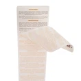
Only core, key information should be displayed; non-essential details should be hidden within inner layers or configured for interactive display (in the case of electronic labels). Strictly adhere to the principle: "Minimal on the Outer Layer, Comprehensive on the Inner Layer."
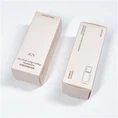
Outer Layer: Retain only primary core information (brand name, product name, key selling points), avoiding content clutter.
Inner Layers: Relocate all secondary information to the interior. Place compliance-related and auxiliary details at the very end of the inner layers to prevent visual distraction.
2. Standardize Fonts and Colors to Enhance Legibility
Font Guidelines: For small-format or curved labels, prioritize clear sans-serif fonts. Ensure a minimum font size of 8 points. Maintain a size difference of at least 2 points between different information hierarchies. Avoid using decorative or "artistic" fonts-which often have poor legibility-for body text.
Color Guidelines: Ensure a text-to-background contrast ratio of no less than 4.5:1. Use high-contrast color schemes for primary information (e.g., white text on a dark blue background, or dark black text on a white background). Use muted light gray tones to de-emphasize auxiliary information. Avoid using color combinations that are too similar to one another, thereby ensuring readability under various lighting conditions.
3. Optimize Layout and Typography to Prevent Obscuration and Clutter
Layout: Apply a consistent text alignment style across all elements within the same hierarchical level. Position core information within the "upper one-third" of the outer layer-the primary visual focal zone. Ensure sufficient "whitespace" (negative space) between distinct groups of information; avoid crowding text against the edges or trim lines.
Clearance: Reserve a minimum clearance zone of 5mm around areas designated for multi-layer folding or peeling; do not place critical text within these zones. For printed labels, ensure precise alignment across all layers to prevent misalignment from obscuring content.
II. Aesthetic Enhancement: Balancing Visual Texture with Stylistic Unity
1. Unify the Design Language to Maintain Stylistic Cohesion
Apply a single, consistent set of design rules across the entire label structure: adhere to the brand's official color palette, limit the use of fonts to a maximum of two styles, and maintain uniform spacing and margins across all hierarchical levels. This approach prevents visual chaos caused by shifting styles between layers, ensuring that the multi-layer label appears cohesive and harmonious when fully unfolded.
2. Employing Contrast to Highlight Aesthetic Layering
Reinforce visual hierarchy through contrasts in size, color, and texture: key information is enlarged and bolded, while supplementary details are scaled down and subdued. Key information is brightened using high-gloss or UV spot finishes, while the background is softened with matte varnish; this contrast in finishes creates a sense of premium sophistication.
Maintain uniform spacing between elements of the same hierarchical level, while utilizing negative space (whitespace) to create separation between different levels, thereby preventing overcrowding and avoiding a cluttered appearance.
3. Adapting to Product Context and Ensuring Practicality
Conform to container contours: For labels applied to curved bottles, anticipate and account for surface distortion in the design phase to ensure text remains legible and undistorted by the curvature. For square or rectangular packaging, utilize a modular block layout to achieve a neat and organized aesthetic.
Allow for "breathing room": Ensure a minimum safety margin of 3mm between all critical design elements and the label's edges to prevent the layout from appearing cramped or constricted after trimming.
4. Optimizing Textural Details
For printed labels, enhance overall texture and quality by using special finishes-such as spot UV, embossing, or hot stamping-to accentuate key information (e.g., the brand logo or product name). For digital multi-layered labels, create a sense of depth and hierarchy through the use of rounded corners, drop shadows, and spacing, thereby avoiding a rigid, stacked appearance.
