


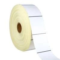
When I first started working in the specialty labels industry nearly a decade ago, I quickly learned that color isn't just a design choice-it's a strategic tool. As a supplier who's partnered with everything from small agricultural operations to large pharmaceutical manufacturers, I've seen firsthand how the right color on a specialty label can improve safety, boost brand recognition, and even reduce compliance risks. Over the years, our team has developed expertise in working with a wide spectrum of colors, each tailored to specific use cases and industry standards. Today, I want to walk you through the colors available for specialty labels, share what makes each unique, and highlight how we match colors to real-world needs.
Let's start with the foundation: specialty labels aren't your average grocery store price tags. These labels serve specialized purposes-think pesticide containers that need to stand out in a field, chemical drums that require immediate hazard identification, or products that need scannable codes in low-light environments. That's why the color options we offer go far beyond basic red, blue, and green; we work with custom hues, industry-mandated colors, and even color-shifting options that add extra functionality.
First, let's talk about standard industry-mandated colors, because for many specialty label applications, these aren't suggestions-they're requirements. Take pesticide labels, for example. Most countries have strict regulations around pesticide labeling, and color plays a critical role in conveying safety information at a glance. In the U.S., the Environmental Protection Agency (EPA) requires that most pesticide labels have a "signal word" section that uses specific colors: red for "Danger" (indicating severe hazards), yellow for "Warning" (moderate hazards), and blue for "Caution" (mild hazards). When we created our Roll Composite Label for pesticide applications, we made sure these mandated colors were easy to reproduce consistently, even on the flexible, tear-resistant material we use. That label's durable construction means it won't fade when exposed to sunlight or harsh field conditions, keeping those critical color cues intact for the life of the product.
For hazardous chemical labels, the standards are even more rigorous. OSHA's Hazard Communication Standard (HCS) aligns with the Global Harmonized System (GHS) to use color coding for hazard classes. Flammable liquids get red labels, oxidizers are yellow, corrosives are blue, and toxic materials use white text on a black background-plus, each has a distinct symbol color. Our High-quality Multi Layer Labels are designed for these exact scenarios; the multi-layer structure lets us print color layers that don't rub off, even when chemicals come into contact with the label. We've worked with chemical manufacturers who say that these consistent colors have helped reduce worker errors in storing and handling chemicals, which is exactly what we aim for with specialty labels.
But not all specialty labels are about safety. Many are about branding and customer experience, and that's where custom color options come in. One of the most common requests we get is for colors that match a brand's exact palette, not just a standard Pantone shade. For example, a craft brewery might want a custom label color that matches their brand logo's deep amber, or a skincare company might need a soft lavender to convey calm and natural ingredients. Our printing process allows us to mix custom inks to any Pantone or CMYK color, ensuring that the label color is consistent across every roll-no variations between batches. We also offer metallic and neon colors, which are perfect for products that need to catch attention on crowded shelves. A local organic food client of ours used our custom neon green labels for their line of salad dressings, and they told us that the color made their products stand out in refrigerated cases where most labels were muted neutrals.
Another area where color matters is in labels with QR and bar codes. The contrast between the code and the label background is crucial for scannability, especially if the label is on a curved surface or in low light. That's why when we print Custom QR and Bar code labels, we pay special attention to color pairs that maximize scanability. Black QR codes on a white background are standard, but we've also done codes in dark blue on light gray, and even white codes on black for products with dark packaging. We test every color combination with our scannability tools to make sure they work on all common scanners, from handheld devices at warehouses to smartphone cameras for product packaging. For small businesses that want their codes to blend a bit more but still scan well, we've had success with muted color pairs like forest green on cream, as long as the contrast meets the required ISO standards.
Clear labels add another layer of color possibility, in a different way. Our Clear Multi-layer Labels are designed to be applied directly to transparent or curved surfaces, like glass jars or plastic bottles. The color here doesn't come from a printed background, but from the ink that's applied over the clear material. For example, a candle company might want a label that looks like it's part of the glass jar, with their brand name printed in gold ink on a clear label. We can also do colored layers inside the multi-layer structure, so the color is protected from scratches and fading. Recently, a craft distillery used these clear labels with custom amber ink for their whiskey bottles, and customers often comment that the color looks like it's part of the bottle itself, which adds a premium feel to their product.
Scratch-off labels are a unique specialty label product, and color plays a fun role here too. Our QR Code Sticker often has a silver or gold scratch-off layer, but we offer custom colors for the area under the scratch-off. For example, a promotion might use a red "lucky" area under the scratch-off, or a green "win" area, to make the reveal more exciting. The scratch-off layer itself is neutral, but the color underneath can be any custom hue, which helps brands create more engaging marketing campaigns. We've seen this used for everything from coffee brand loyalty programs to concert ticket giveaways, and the color of the reveal adds an extra element of surprise for customers.
Beyond these standard and custom color options, we also work with color-shifting inks for specialty applications. These inks change color depending on the angle of light, which is great for anti-counterfeiting measures. For example, a luxury perfume brand might use a color-shifting ink on their label, so when you look at it straight on it's blue, and at an angle it's purple. This makes it much harder for counterfeiters to replicate, protecting both the brand and consumers. We also use UV-reactive inks, which only show color under black light-this is common for event tickets or product authenticity labels, where a hidden color cue adds an extra layer of security.
One thing I always emphasize with clients is that color selection for specialty labels isn't just about how it looks. It's about durability too. If a label is going to be outside in the sun, or in a cold storage warehouse, the ink needs to resist fading, cracking, or smudging. That's why we use UV-resistant inks for outdoor labels, and water-based inks for labels that will come into contact with moisture. We test every color we use in our own facility, exposing samples to sunlight, extreme temperatures, and chemicals to make sure the color stays consistent over time. Last year, a fruit farmer came to us because their previous labels would fade after a few weeks in the sun, making it hard to tell which was organic and which was conventional. We worked with them to develop a custom green and red label set using UV-resistant inks, and they reported that the colors stayed bright for the entire growing season.
I should also mention that color accessibility is a big consideration now more than ever. Many brands want their labels to be readable by people with color vision deficiency (CVD), which affects about 8% of men and 0.5% of women. We use tools to test color combinations for CVD compatibility, making sure that labels that rely on color coding are still distinguishable for everyone. For example, instead of just red and green for hazard labels, we'll add symbols that complement the color, so even someone who can't tell the red and green apart can still understand the warning. This is part of our commitment to making specialty labels that work for all users, not just the majority.
Over the years, I've learned that every client has a unique color need, and our job as a specialty label supplier is to listen and deliver. Whether it's a mandated color for a hazardous chemical label, a custom hue that matches a brand's exact logo, or a special color-shifting ink for anti-counterfeiting, we have the tools and expertise to make it happen. We don't just print labels-we solve problems, and color is a key part of that.


If you're looking for specialty labels for your business, whether you need pesticide labels, bar code labels, multi-layer labels, scratch-off stickers, or any other type of specialty label, we're here to help. Our team can walk you through all the color options, test combinations for durability and scanability, and create labels that meet your specific requirements. We've worked with businesses of all sizes, from startups to Fortune 500 companies, and we take pride in delivering high-quality labels that make a difference.
To connect with our team and discuss your specialty label needs, reach out to our sales team today. We're ready to help you choose the right colors, materials, and designs for your next label project.