


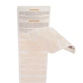
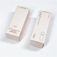

I. Layered Design: Clear Roles for Each Layer
Readability of multi-layered labels begins with structural logic. Each layer should serve a different function, avoiding information overload:
1. Top Layer: Focus on Core Information
Retain only the brand name, product name, main visual, and key selling points (e.g., "Additive-Free," "SPF50+"). Use larger, bolder fonts and strong color contrasts to ensure long-distance visibility.
2. Middle Layer (Peelable Layer): Display Extended Content
Include usage instructions, ingredient highlights, promotional information, or QR code entry. Guide users through dashed boxes, arrow icons, or "Peel to View" prompts.
3. Bottom Layer (Fixed Layer): Permanently Visible Compliance Information
Production date, batch number, registration number, etc., must be partially visible without tearing the label. A "window-style design" can be used, reserving transparent windows or cutout areas on the top layer to display key fields.
II. Visual Optimization: Improve First-Glance Reading Efficiency
Even with layered information, disorganized layout can still hinder reading. The following visual principles should be followed:
1. Clear font hierarchy: Headlines should be 16–18pt, body text 10–12pt, and footnotes no less than 8pt, ensuring that small font sizes remain legible.
2. Reasonable color contrast: Dark text on light backgrounds (e.g., black text on a white background), avoiding red and green combinations, and catering to colorblind users.
3. Coherent and unfragmented layout: Group similar information together, avoiding disjointed distribution that creates cognitive burden.
4. White space and separation: Use spacing or thin lines to separate different modules, improving block recognition.
III. Interactive prompts: Let users "know they can unlock"
Many users ignore mid-level information due to a lack of prompts. Enhance operability perception through the following methods:
1. Add graphic and textual prompts such as "▲ Peel off here" and "↑ Expand details"
2. Use gradient shadows or 3D borders to simulate a "peelable" effect
3. Preview the peeling state in the main packaging visual to create psychological expectation.
IV. Multi-platform Adaptation: Catering to Different Usage Scenarios
With the widespread adoption of mobile work and QR code scanning, labels also need to adapt to various reading environments:
1. Mobile-Friendly: QR code size no smaller than 2cm × 2cm, with surrounding white space ≥ 3mm to ensure easy scanning by mobile phones.
2. Responsive Layout: Prioritize displaying the local language on small labels, with other languages presented through the expanded page.
3. Haptic Assistance: Use micro-embossing for important areas (such as the peeling point) to facilitate finger positioning.
V. Testing and Verification: Conduct a readability assessment before launch
After design completion, it is recommended to conduct three simple tests:
1. 3-Second Rule Test: Can an average person identify the product name and core functions within 3 seconds?
2. Blind Test: Can random users naturally discover and correctly peel off the middle layer?
3. Long-Distance Identification: Is the key information clearly visible at a distance of 1 meter?
