



I. Core Goal of Design Optimization: Make it "Easy to Understand" for Consumers
Labels are not only a compliance requirement, but also the first point of contact between brands and consumers. Design optimization should focus on "easy to identify, easy to understand, and easy to trust," addressing past criticisms such as "overcrowded small print," "mixed colors," and "hidden placement."
1. Highlight Key Information and Improve Readability
Production date and expiration date must be "easy to find, clear, and require no calculation":
Place them on the main display surface of the packaging (the first thing consumers see); Use a font no less than 3 mm high, preferably bold or thick Song typeface, avoiding thin-line fonts; Use high-contrast combinations such as white background with black text or yellow background with black text, avoiding low-visibility colors such as gray and light blue;
Simultaneously label both the "production date" and "expiration date" to avoid requiring consumers to calculate them themselves.
1. Ingredient List Sorting Must Be Standardized:
Ingredients should be listed in descending order of quantity, and the true composition must not be concealed; Food additives must be labeled with their specific names (e.g., "potassium sorbate," not just "preservative"); Allergen information should be labeled separately, such as "contains soy products" or "production line also processes nuts."
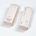
2. Optimize Layout and Enhance Visual Logic: Adopt a modular, zoned design, dividing information into:
Brand Area (Logo, Product Name)
Core Information Area (Net Content, Specifications, Date)
Ingredients and Nutritional Information Area (Ingredients, Nutrition Facts)
Qualification Information Area (SC Number, Standard Code, Contact Information)
Avoid information "filling the screen," leaving appropriate white space to improve reading comfort;
Highlight key content using bolding, borders, and background blocks, but avoid excessive decoration that could compromise seriousness.
3. Unify Font and Color System to Establish Brand Identity
Use a unified font family across the entire packaging line (e.g., Source Han Sans for Chinese, Roboto for English) to enhance brand consistency;
Match the main color scheme with the brand tone, while ensuring sufficient contrast between text and background brightness;
Add micro-design elements (e.g., icon guidance, small illustrations) to enhance approachability, but these must not interfere with the identification of key information.
II. Technical Support for Durable and Clear Labels
Even the best design is useless if the printing is unclear or easily detached. Recommendations:
Prioritize thermal transfer or laser coding technology, which is more resistant to friction and tampering than inkjet printing;
Use low-temperature resistant label materials for refrigerated and frozen foods to prevent moisture damage and wrinkling;
For export products, consider bilingual or multilingual label layout and plan the spatial layout in advance.
III. Optimize Interaction Details Based on User Behavior
Design with "warmth" by starting from the actual usage scenarios of consumers:
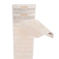
Add a "tear-off indicator line" to the side of the bottle or bag for easy viewing of the inner packaging date after opening;
For multi-item packs, clearly indicate "Contains X servings, each serving expires on XXXX year XX month XX day" on the outer box;
For elderly consumers, consider enlarging the font size or adding a note next to the QR code: "Scan to listen to instructions."
