


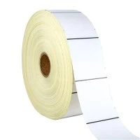
In the industrial landscape, the visibility of labels is not just a matter of aesthetics; it's a critical factor for safety, compliance, and operational efficiency. As an industrial labels supplier, I understand the challenges and opportunities that come with making these labels stand out. In this blog, I'll share some effective strategies to enhance the visibility of industrial labels.
1. Color Selection
Color is one of the most powerful tools in making labels visible. Bright and contrasting colors can catch the eye from a distance. For example, using a combination of black text on a yellow background is a classic choice for Warning Label because it provides high contrast and is easily recognizable.
When selecting colors, it's important to consider the environment where the label will be placed. In a dimly lit area, lighter colors or fluorescent hues can be more effective. On the other hand, in a brightly lit industrial setting, darker colors with high contrast can make the label stand out.
It's also crucial to follow industry standards and regulations regarding color usage. For instance, certain colors are associated with specific types of warnings in safety labels. Red is commonly used for danger, yellow for caution, and green for safety. By adhering to these standards, you not only make the label more visible but also ensure that it conveys the correct message.
2. Font and Typography
The choice of font and typography can significantly impact the readability and visibility of industrial labels. A clear and legible font is essential, especially when the label needs to be read from a distance or in less-than-ideal lighting conditions.
Sans-serif fonts are often a good choice for industrial labels because they are simple and easy to read. Avoid using overly decorative or fancy fonts that may be difficult to decipher. The size of the font should also be appropriate for the intended viewing distance. A label that is meant to be read from a few feet away will require a larger font size than one that is meant to be read up close.
In addition to the font itself, the spacing between letters and lines can also affect readability. Adequate letter spacing (kerning) and line spacing (leading) can make the text easier to read, especially on labels with a lot of information.
3. Label Placement
The placement of the label is another important factor in its visibility. Labels should be placed in a location where they are easily visible and not obstructed by other objects. For example, on machinery, labels should be placed on the front or side where operators can easily see them.
In areas with high traffic or where there is a lot of movement, labels should be placed at eye level or in a prominent position. This ensures that they are not overlooked. It's also important to consider the orientation of the label. A label that is placed horizontally may be more visible than one that is placed vertically, depending on the viewing angle.
4. Material Selection
The material used for the label can also affect its visibility. Different materials have different properties, such as reflectivity, transparency, and durability. For outdoor applications, labels made from weather-resistant materials are essential to ensure that they remain visible over time.
Reflective materials can be particularly effective in low-light conditions. They reflect light back to the viewer, making the label more visible at night or in dimly lit areas. Transparent materials can be used when the label needs to be placed over an existing surface without obscuring it.
5. Use of Graphics and Symbols
Graphics and symbols can enhance the visibility and understanding of industrial labels. They can convey information quickly and effectively, especially for people who may not be able to read the text on the label. For example, a Warning Sticker with a picture of a broken glass can immediately convey the message that the item is fragile.
When using graphics and symbols, it's important to ensure that they are clear and easily recognizable. They should also be consistent with industry standards and regulations. For example, the use of standard safety symbols can help to ensure that the message is understood by a wide range of people.
6. Customization
Customization is a key advantage of working with an industrial labels supplier. By customizing the label to meet the specific needs of the customer, we can ensure that it is both visible and effective. This may include using custom colors, fonts, graphics, and sizes.
For example, a company may require a Custom Warning Tags with a specific logo or message. By working closely with the customer, we can create a label that not only meets their requirements but also stands out in the industrial environment.


7. Maintenance and Inspection
Once the labels are installed, it's important to maintain and inspect them regularly. Over time, labels can become faded, damaged, or obscured. Regular maintenance can help to ensure that the labels remain visible and effective.
This may include cleaning the labels to remove dirt and debris, replacing damaged labels, and updating the information on the labels as needed. By keeping the labels in good condition, we can ensure that they continue to provide the necessary information and warnings.
Conclusion
Making industrial labels more visible is a multi-faceted process that involves color selection, font and typography, label placement, material selection, use of graphics and symbols, customization, and maintenance. By implementing these strategies, we can create labels that are not only visible but also effective in conveying the necessary information and warnings.
If you're in need of high-visibility industrial labels, I encourage you to reach out to us. We have the expertise and experience to create custom labels that meet your specific needs. Whether you need warning labels, safety stickers, or custom tags, we can help. Contact us today to discuss your requirements and start the process of creating labels that will make a difference in your industrial environment.